Ginger Bisquite

Lifestyle, DIY, Family & Food

Reorganising a cluttered wardrobe

August 6, 2014 by Jenni Clutten | 0 comments

 reorganising a cluttered wardrobe

Does your bedroom look like this? Oh good, maybe I’m not the only one then!

I am pleased to say we are finally decorating our bedroom and the first job was to clear out the wardrobes.  Here are my top tips for doing the same, and some great storage and shelving ideas for how to keep it tidy.

Step 1.
DE CLUTTER

Remove everything from your wardrobes and sort through it into piles. Of the stuff you don’t want, you probably don’t just want to throw it all in the bin.  Some of my stuff was too small, some I didn’t like it and some had holes in it. To sort through it efficiently I made 4 piles.

  • Sell (Ebay, Car boot etc.)
  • Give to a charity shop
  • Stuff to give to rag bag collection (i.e not good enough for charity shop, stains, holes etc.)
  • Rubbish

I suggest you have a think about this before you start so that you are not having to go through clothes multiple times.  Divide in advance and remember anything you have to sell won’t be leaving the house as quickly as you might like as it takes time to list and sell things.  Try to be as brutal as you can.  If you find things you had forgotten you even owned then you probably have too much stuff.

Step 2.
ASSESS YOUR NEEDS

Think about what you have left.
What do you need to access on a regular basis?
Are there things that regularly end up on the floor?
Are the spaces in your wardrobe well divided?
Can you always find what you are looking for?

Once you have answered these questions you can work out what extra storage you might need to help solve these problems.

My problem areas:

  • Clothes falling off shelf onto wardrobe floor
  • Can’t reach back of shelf
  • Space to organise scarves

For us, our wardrobes have 1 large shelf and a hanging rail, so it was helpful to divide the spaces up into smaller areas.  Interestingly, although my husband and I have the same wardrobe, we each did this differently to suit our own use.  I think this shows how there are lots of different options and that everyone uses space differently.

To divide up my space I used three baskets to divide up the top shelf, into an area for T-shirts, Jumpers and Cardigans, and skirts and shorts.  Then an accessory hanger for scarves and necklaces to keep them all in one place.

3 of the best storage baskets
Step 3
PUT IT AWAYPut away what’s left, thinking about what you need and use on a daily basis. For example, I like to have pajamas in the most accessible place so I can grab them as I drag myself into bed exhausted each night!

Disclosure: Post in collaboration with homebase, all thoughts, words and opinions my own.


Creating a garden office

May 23, 2014 by Jenni Clutten | 3 Comments

We are still in the process of creating a garden office as a new and productive space for us to inhabit.  Our plans began when we bought our house and inherited 2 sheds.  One is quite large and with a little TLC we knew it would be a perfect way to give us an extra room without resorting to an extension.

A lick of paint:
It is quite amazing what a quick lick of paint can do for a place.  I painted our shed before winter set in last year and after just one lick of paint it was already looking unrecognisable!  And why stop there?  By painting the inside you can create a light and bright environment too.  Don’t forget to raid your local community repaint scheme.

Get wired up:
If you don’t already have an electricity supply, then I’d invest in having one installed.  This way you can work without fear of your battery running low or even work away long in to the evening.  A power supply is vital for sewing machines, lighting and turn an old shed into a executive office space!  For internet access, you may find your wifi extends as far as the shed, but otherwise a wifi signal booster may be required.
Keeping Warm:
Insulation heating and flooring are a must.  With minimal expense they give that homely feel to a place as well as ensuring that .  I am a big fan of vinyl flooring, which is easy to lay, warm and looks luxurious.  There are a few ways to insulate a shed but for the long run, foil bubble wrap works well with plasterboard over the top.  To keep warm I’ve also bought a fan heater which will enable use to keep the chill off in the winter and works as a fan in the summer.

Personalisation:
Pictures, posters and soft furnishings all transform a space to make it unique and a joy to work in.  A garden office should be comfortable and inspiring, a place where you actually want to spend time!  I just love the idea of adding beautiful curtains, practical as they will keep the drafts out but adding a chic tone too.

Disclosure:
Post in collaboration with Carpet Right, all thoughts, words and opinions my own, unless otherwise stated.

First Time Wallpaper’er

April 11, 2014 by Jenni Clutten | 4 Comments

wallpaper,beforeafter.TEXTI have an admission to make – despite lusting over many a design, I have never actually hung wallpaper.   Many times have I admired it, shared it and dreamed of it but never had it graced my walls.   I was a first time wallpaper’er.

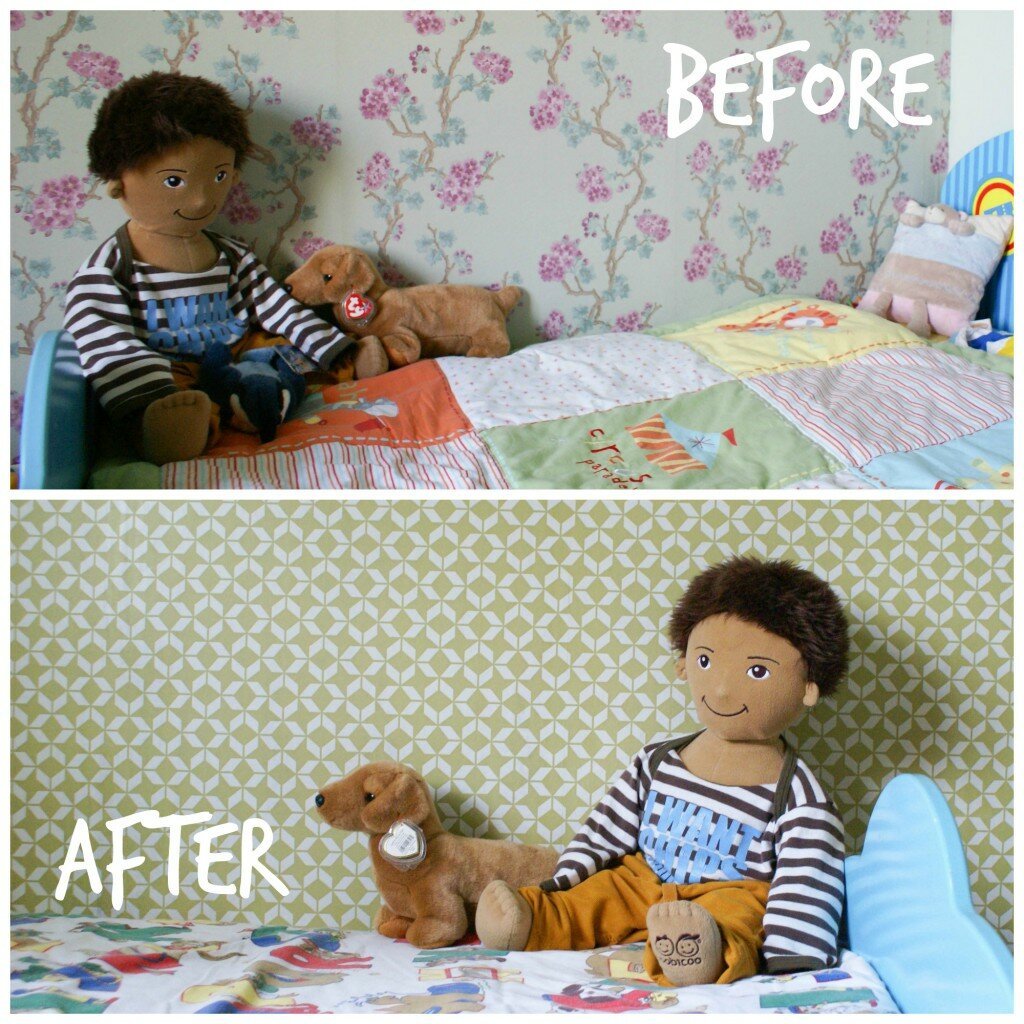
That was until I moved into a house with floral wallpaper all over my sons bedroom and no time to remove it.  That’s the thing with wallpaper isn’t it, it’s so personal.  I wonder if anyone has ever moved into a house and kept the previous owners wallpaper long term.  We’re planning to live here for many years to come so when decorating our house I’m going for designs I really love without giving a second thought for resale potential.

I tested the ground of wall patterns when I installed cloud decals in the nursery and I absolutely loved the fun look they gave to the room. So, on with the wallpaper show!

You will need: (I watched the video tutorial on the  channel before I started)

  • Wallpaper Paste
  • Bucket
  • Stirrer
  • Wallpaper Brush
  • Sharp Knife
  • Scissors
  • Wallpaper
  • Microfibre Cloth
  • Ladder/Step Stool
  • Tape Measure
  • Spirit Level
  • Pencil

hanging wallpaperSONY DSC

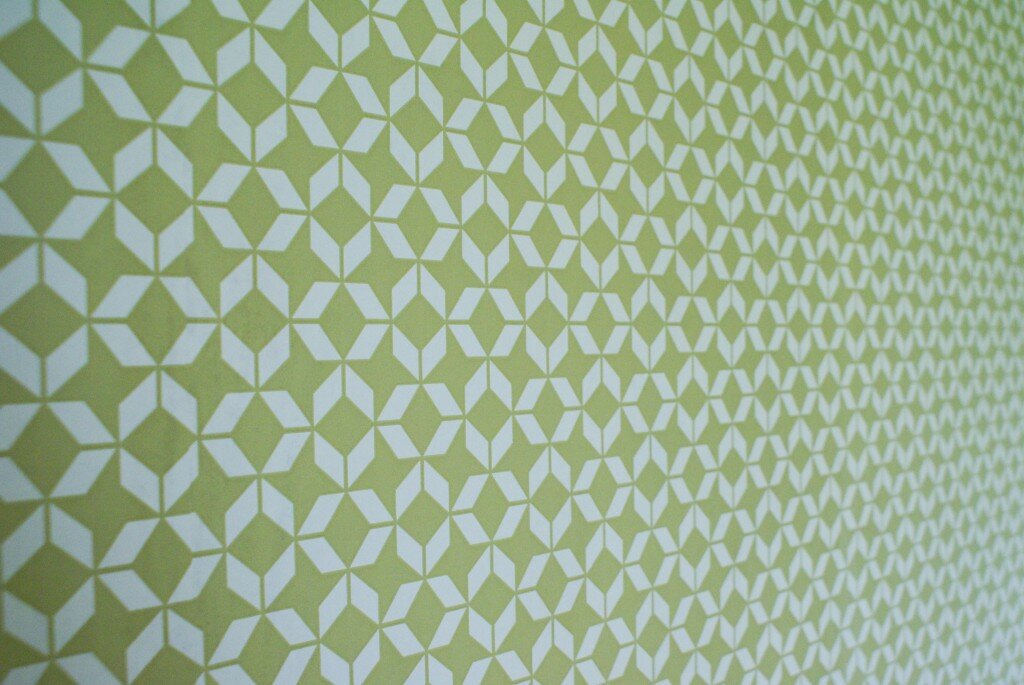
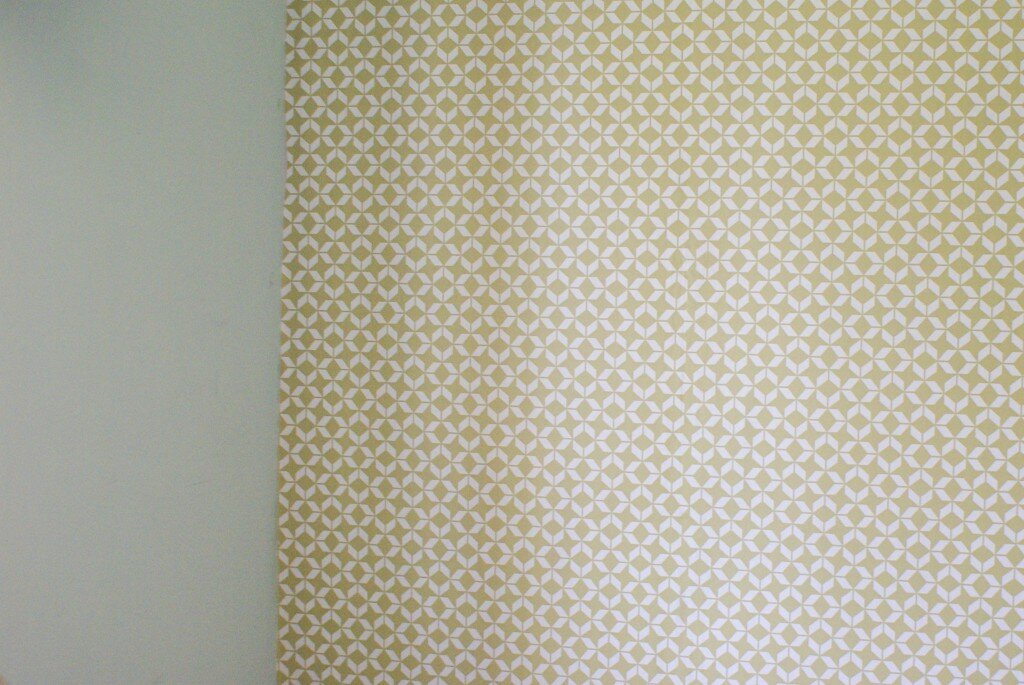
 As novices, it seemed best to start with some inexpensive paper as a trial run.  This wallpaper is called Brooklyn and I got it on clearance in B&Q, £5 for 3 rolls!  We originally got it for our bedroom but I realised it would look great in Nye’s bedroom.  It’s paste the wall wallpaper so we mixed the wallpaper paste to its thickest setting and applied it straight to the wall before lining up the wallpaper. (And no, we didn’t remove the old wallpaper or start in the middle).  In the end we used about 1 1/2 rolls and it was easy to line up because it has a very busy repeat pattern.

In terms of timing, this first wall took us about 2 hours.  Because it was our first time with wallpaper we double checked all the measurements and then had to rehang the paper after I got a bit snap happy and trimmed too much off the bottom of the first sheet.  (At that point I was pretty fed up, but carried on regardless).  Despite this, in the evening we decided to hang our Marimekko Kippis wallpaper in the dining area (A cheeky Ebay purchase for £30).   Because we still had a huge amount of wallpaper paste lying around unused and all the tools still out it seemed sensible to continue.  The dining room wall only took an hour, as we already had a good wallpaper work flow worked out.
SONY DSCThere’s still much to finish off in the bedroom and dining area but I’m so pleased to know that we’ve at least started to put our own stamp on the house (and learnt a new skill).  They’ll be more to share in the next few weeks as the rooms start to take shape.

How about you?  Been lusting after some gorgeous wallpaper prints? Are you a pro or a first timer like me?
Love Chic Living and Love Your Home

Create a Tranquil Bedroom

March 7, 2014 by Jenni Clutten | 0 comments

We’re still in the process of adding a bit of personality to our new home.  It’s now 5 months since we moved here but still all we’ve really tackled has been the living room and the nursery.  I have our bedroom in our sights now and the main sense I want to create is a haven of peace and tranquility.

Here are some of my favourite pieces from across the net that I think create a tranquil bedroom:Create a Tranquil Bedroom

We all know that the bed is the main focal point of any bedroom, so double bed frames feature high on my wish list when it comes to creating a perfect feel.  Then next it has to be the lighting, the copper bedside lamp adds something sleek and modern.  I feel it really gives the scheme a quirky edge taking a calming scheme from dull to alluring.  The look is then completed by a beautiful set of side tables and a must have scent from Jo Malone. (All sources available by clicking on the moodboard above).
What makes you feel relaxed in the bedroom? I personally love the feel of crisp cotton and that satisfying feeling of freshly washed sheets.
Disclosure: Post written in collaboration with Carpetright, all words and opinions my own.

Willow and Hall Interview

February 28, 2014 by Jenni Clutten | 21 Comments

Willow and Hal

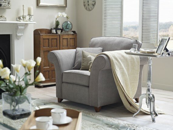
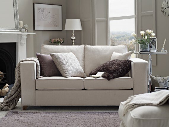
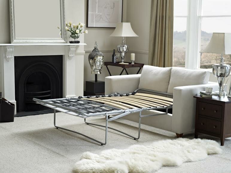
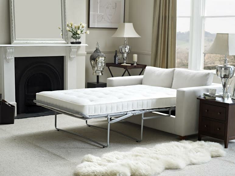
I was recently lucky enough to be given the opportunity to interview the lovely Sarah Massouh, owner of Willow and Hall.  I had been aware of their wonderful sofas and sofa beds for a little while due to the post on Tigerlillyquinn’s blog and I loved the designs instantly.  At the time I hadn’t realised that their products are made in the UK and that their sofa beds also include a wonderfully luxurious mattress (with an affordable price tag.)

Want to know more? Carry on reading to get the full low down on Willow and Hall including which 5 products Sarah has in her own home.  (A true sign of believing in your brand I hope you’ll agree.)
bed_1_2_ langridge_chair_dressed wilton_head_on_cush_2

Q: What made you want to start Willow and Hall?
A: My passion for British furniture/interior design and my frustration with the lack of availability of high quality British furniture at more affordable prices resulted in me setting up Willow and Hall in 2012.  The creation of the business and what is still central to everything we do today is to design British furniture which looks beautiful and is stylish whilst also being really high quality and comfy. I wanted to provide all of this for our customers at fantastic value and combined with a high quality and personal service.

Q: In a crowded market place, what do you think makes Willow and Hall unique?
A: We believe the success to date of Willow and Hall is down to a number of factors: Firstly we are able to offer our furniture at much lower prices than the high street and even our online competitors as we focus entirely on the products removing the need to pass on other costs to customers such as shops and warehousing costs. We are also able to offer our customers a custom range of options (they can choose from over 70 fabrics and leathers; choose their seat fillings; and the sofa beds all come with a choice of three different mattresses); delivery is speedy (3-4 weeks for all items); the materials are of very high quality (all hand-picked ourselves); and a fantastic amount of British craftsmanship goes into every single item. All this is combined with a passion for providing excellent customer service (we’ve just been awarded a Gold Trusted Merchant award by the independent feedback service FEEFO).

Q Which products do you have in your own home?
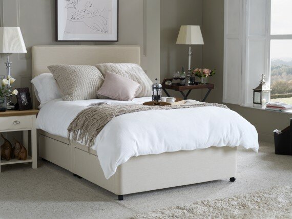
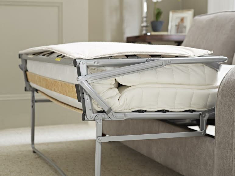
A: I have five products in my home – I can’t squeeze any more in with our older furniture at present! We have a sofa bed in our living room (the Elmley) for when our family and friends come to stay as we are a very sociable family so wanted a super comfy sleeping option without compromising on the style and comfort. We then have an Apply 1 seater in the corner of our study. This gets used more as a sofa for people to come in and sit on and have a natter when I am working too late but it is also nice to know it can be pulled out into a bed if we should need it. Finally all three of our beds in our bedrooms have our mattresses. They are quite simply the most comfortable mattresses my husband and I have ever slept on – guests say the same too. I could not imagine having any other mattresses in our house. I can’t wait to bring our bed range out so that more customers will be compelled to purchase these beautiful mattresses.
41 2

Q: What influences your product designs?
A: It’s absolutely about designing furniture which looks beautiful and is stylish whilst also being really high quality and comfy. Once we’ve achieved this we work extremely hard to make sure all the smaller details are just right for that particular model from the feet shape to the piping and zips. All the “ingredients” must always be of the highest quality and used in the right way by incredibly skilled craftsmen in Wiltshire.

Q: Which designs and fabrics would you recommend for young families?
A: Firstly I would advise families to carefully consider how they will be using the room the furniture is going in. Young families are often very busy and require multiple uses for rooms such as using a living room as a TV room, play room and social space. I would therefore recommend that they pick a design which size does not over-power the room/ fits neatly into the space taking into account its uses. A sofa should always fit around a family and their lifestyle not the other way around.  

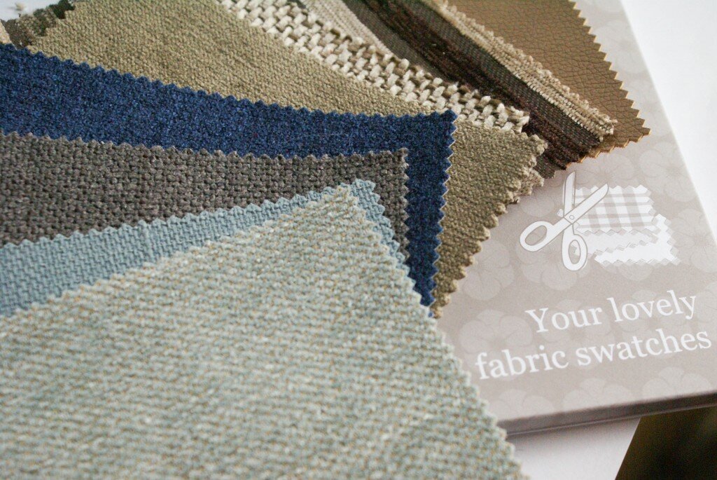
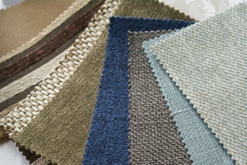
Secondly, I would recommend picking a fairly neutral fabric so that it fits with changing family decors but that is not too light so that it shows up a multitude of sins which are inevitable with a young family. Greys are a good choice as they are still relatively neutral yet dark enough to not show up every mark. Other fabrics which work well are patterned/ striped fabrics or two-toned fabrics such as out Textured Linen. You can always add further colour/ lighter colours through cushions and throws – a far safer way to bring these colours into your furniture. Also consider the functionality of the fabric – this is just as key as aesthetics here. Find out what the rub counts and cleaning instructions are for the fabrics to get an idea of their durability and practicality. As a rule, synthetic fabrics are more durable, colourfast and cleanable. Tightly woven fabrics and fabrics that are heavy will stand up to wear and tear better, as will leather.
Willow and Hall SwatchesWillow and Hall Swatches Willow and Hall Swatches

Q: Would you like to expand the business into other areas?
A: Absolutely! We want to be able to offer great quality and affordable British furniture to even more customers and to more parts of their homes. With this in mind we will be introducing new sofa/ sofa bed 2 and 3 seater designs as well as some stunning new sofa/ sofa bed corner units in March this year. We will also be introducing a beautiful range of footstools and blanket boxes to perfectly complement our furniture in early Summer as well as a completely new bed range to accompany our hand-made bed mattresses.

Q: I understand you’re opening a show room in Surrey, what made you want to branch out from the online world?
A: The opening of our first showroom will give customers the chance to view our lovely products before they purchase without us having to compromise on the value we offer. We believe this provides our customers with an even better service over and above our 100% free returns policy that we currently offer. We will never open up shops or a large range of showrooms as we don’t want to pass these costs onto our customers however opening up one showroom does give this option to those nervous to purchase entirely online.

——————————————————————————————————————————————————————————–

So a big thank you to Sarah for taking the time to answer my questions so thoroughly, I thought her ideas on family friendly options were especially useful and I can’t wait to head to the showroom for a nose.  My personal favourite is the rather stunning Dunsmore Sofa Bed which I’ve been showing my husband suggestively all day.  I think it would make a gorgeous addition to a nautical themed living room or an art deco bedroom and the leather makes it very practical and long lasting.
Willow and Hall

Disclosure: Post written in collaboration with Willow and Hall, all words and opinions my own unless otherwise stated.

Choosing Statement Mirrors

January 31, 2014 by Jenni Clutten | 18 Comments

mirror

Selecting a mirror can be an easy and affordable way of updating any room, personalising a previously boring space.  I think mirrors create a homely and light feeling which is especially useful during these dark days.

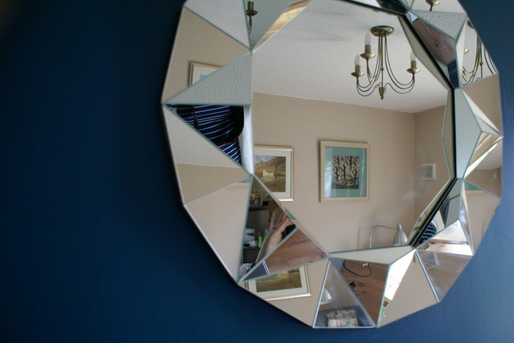
I was recently contacted by Argos and asked if I would like a mirror to review and jumped at the chance.  I selected the Living Faceted Round Wall Mirror as I have been admiring this angular style for some time.  I was pleasantly surprised to see how affordable their range of mirrors was and this one had particularly good reviews.  Now I have it I can see why, as it certainly creates a real designer look in our living room.

When choosing mirrors it is important to consider the style and size.  A large statement mirror can really draw attention so it’s important to think about where to locate it to show it off to its best potential.  You can either choose something that complements the rest of your decor or select a new style using the mirror as inspiration for your new design.

I chose to use this mirror as the starting point for a new living room design and it has encouraged me to be bold and create a feature fireplace.  To do this I selected a bold teal paint to use behind the mirror creating a fantastic contrast against the lines of the mirror.  I can’t tell you what a difference having such a statement piece has made, it’s really brought the whole room together with just a quick lick of paint and a few screws.

This is the first project we have tackled in the living areas of the house since we moved in and has really spurred me to carry on with some other small makeovers in each room to make it feel a little more like our space.  Stay tuned for more updates!

DISCLOSURE:
Post in Collaboration with Argos, but all opinions are my own.

Natural Living Room

January 10, 2014 by Jenni Clutten | 16 Comments

This week I have been working on a natural living room style board to inspire my lovely friends Ally and Ben now the Teal Bedroom has been sorted.  I started by discussing which pieces of furniture they had that they would be keeping, and their general ideas for the space and went from there.

DESIGN BRIEF:

  • Neutral colour scheme including creams and greys
  • Cream Leather Sofas
  • Oak Mirror
  • Natural Carpet
Natural Living Room
Sources at Polyvore

MY DESIGN:
With any design, we usually have items that we want to incorporate into our new plans.  The natural colour scheme selected works well with the cream sofas they already own as well as their oak mirror.  In my mood board I’ve used a basic Ikea cream sofa just to show how the mix of colours work together.  Ally was keen to include lots of wood into the design, and specifically asked for a wooden lampshade to create a lovely cosy glow.  I then added lots of different natural textures to show how they could be layered together.

Next I turned my attention to some furniture that would complement what they already have.  I thought the China Clay paint worked perfectly with the striking wooden tv cabinet from furnitureplus.  And of course no room is complete without some little trinkets. I especially like the Golden Rules print and this amazing Do What You Love pillow.

For more inspiration on creating a natural living room, take a look at the .

Disclosure: This post contains affiliate links, all words, thoughts and opinions are my own.

Teal Bedroom Ideas

December 30, 2013 by Jenni Clutten | 15 Comments

The Teal Bedroom
The Teal Bedroom sources
My wonderful friends Ally and Ben recently bought a house and have been painstakingly renovating it from top to toe.  I’m talking moving doorways replumbing, knocking down walls and installing central heating amongst many many other things.  As things near an end,  it’s time to start thinking about how to finish off the rooms to turn this house into a home. starting with some teal bedroom ideas. 

DESIGN BRIEF:
Magnolia Walls
Teal Feature Wall
Ikea Pax wardrobes
Maroon Bedding
Oak Bed


MY DESIGN:
Ally wanted to use some of the items they already had and had been given (the bed, the magnolia paint, maroon bed linen and the wardrobes)  She then decided she wanted to add a bid of colour with a teal feature wall and I have used this brief to design the above mood board).

With this colour scheme I think you have two choices, to carry on with the sharp zingy modern feel or choose some more calming tones.  I’ve highlighted this with two options of alternative bed linen, one more modern design from Ikea and an alternative more neutral set from Dunelm Mill.  I also think this teal design will go well with their already owned maroon set, and if Ally decides to keep their old stuff (house renovation is an expensive business), by simply adding a few maroon trinkets this will pull everything together.

With the thrifty theme in mind, I was also thinking about a few low cost pieces of art that would really personalise the room.  As Ally has a geography degree and is currently training as a geography teacher I love the idea of creating something to hang using maps.   I love the options below and all only require a frame (easily picked up from a charity shop, car boot or IKEA) and items you would have in the cupboard at home.

map art diy