Ginger Bisquite

Lifestyle, DIY, Family & Food

Reorganising a cluttered wardrobe

August 6, 2014 by Jenni Clutten | 0 comments

 reorganising a cluttered wardrobe

Does your bedroom look like this? Oh good, maybe I’m not the only one then!

I am pleased to say we are finally decorating our bedroom and the first job was to clear out the wardrobes.  Here are my top tips for doing the same, and some great storage and shelving ideas for how to keep it tidy.

Step 1.
DE CLUTTER

Remove everything from your wardrobes and sort through it into piles. Of the stuff you don’t want, you probably don’t just want to throw it all in the bin.  Some of my stuff was too small, some I didn’t like it and some had holes in it. To sort through it efficiently I made 4 piles.

  • Sell (Ebay, Car boot etc.)
  • Give to a charity shop
  • Stuff to give to rag bag collection (i.e not good enough for charity shop, stains, holes etc.)
  • Rubbish

I suggest you have a think about this before you start so that you are not having to go through clothes multiple times.  Divide in advance and remember anything you have to sell won’t be leaving the house as quickly as you might like as it takes time to list and sell things.  Try to be as brutal as you can.  If you find things you had forgotten you even owned then you probably have too much stuff.

Step 2.
ASSESS YOUR NEEDS

Think about what you have left.
What do you need to access on a regular basis?
Are there things that regularly end up on the floor?
Are the spaces in your wardrobe well divided?
Can you always find what you are looking for?

Once you have answered these questions you can work out what extra storage you might need to help solve these problems.

My problem areas:

  • Clothes falling off shelf onto wardrobe floor
  • Can’t reach back of shelf
  • Space to organise scarves

For us, our wardrobes have 1 large shelf and a hanging rail, so it was helpful to divide the spaces up into smaller areas.  Interestingly, although my husband and I have the same wardrobe, we each did this differently to suit our own use.  I think this shows how there are lots of different options and that everyone uses space differently.

To divide up my space I used three baskets to divide up the top shelf, into an area for T-shirts, Jumpers and Cardigans, and skirts and shorts.  Then an accessory hanger for scarves and necklaces to keep them all in one place.

3 of the best storage baskets
Step 3
PUT IT AWAYPut away what’s left, thinking about what you need and use on a daily basis. For example, I like to have pajamas in the most accessible place so I can grab them as I drag myself into bed exhausted each night!

Disclosure: Post in collaboration with homebase, all thoughts, words and opinions my own.


Wet Room Ideas for a Small Bathroom

August 4, 2014 by Jenni Clutten | 0 comments

wet room ideas

A few weeks ago I accidentally flooded our bathroom.

After a long day, I started running a bath as soon as the children were tucked into bed for the night.  Before I knew it, I heard a dripping sound in our hallway and suddenly it dawned on me.  I chased up the stairs, observing the water seeping through every available crevice in the bathroom floor.  It was totally careless, but a symptom of family life.  There is so much to get done and the last thing on my mind is some R&R.  So, if our bathroom didn’t need a rethink before, it certainly does now!

In this hot weather, thankfully it only took a few days to dry out, but we are left with a few water marks here and there and the knowledge that it could easily happen again.  This is why the idea of a wet room seems so appealing, not having to worry about the splashes from the bath and shower on a day to day basis and avoiding the drama of a big accident.

With this in mind, here are my wet room ideas for a small bathroom:

Creating Space Our bathroom is small like most bathrooms, with just enough room for a bath, a sink and a toilet.  The great thing about a wet room from My Bathrooms UK is that you are using all the space you have. No confined shower cubicles, to take up yet more space or need to worry about wonky walls and cramped corners.

A sense of luxury I’ve stayed in some lovely hotels and the best of them have had beautiful wet rooms, giving you something extra special for while you’re away.  But why should a wet room only be for a special occasion, especially as a wet room is practical too.   To top the luxury look off you’ll need some accessories, starting with some thick and fluffy towels.  I love the beautiful quality and simplicity of The White Company‘s collection.

A modern design We’ve all had such similar bathrooms for such a long time, a few tiles, the same old sanitary wear.  A wet room gives you the chance to create a striking space.  They give a truly modern streamlined look that should outlast more traditional styles and add value to your house.

p.s If you’re interested in some more home inspiration, you can take a peek at our living room feature wall.

Disclosure: This is a collaborative post, all thoughts words and opinions are my own.

Capturing the Tactile Textures Trend in the Bathroom

July 3, 2014 by Jenni Clutten | 1 Comment

This year, one of the big trends in interiors is Tactile Textures.  It incorporates bold design choices with a range of different textures, through the walls, floors, materials and objects used.  I especially love this look in bathrooms where it’s possible to create a luxury look with big soft towels, textured tiles and modern bathroom fittings that are set against contrasting items.

C. P Hart Tactile Textures

C.P. Hart Tactile Textures

With tactile textures you can use rustic natural objects, such as wood and stone, contrasting against matt black smooth textures and bold and industrial concrete walls. A juxtaposition if you will!

My favourite pieces are those that really give the bathroom a statement look, the kind of look you would imagine for a wonderful spa or luxury hotel.  Wouldnt it be great to create something just as special at home?  The easiest way to create a striking new look is to use Bathroom showrooms as an invaluable source of inspiration.  The best ones can give you an idea of what you like and how much space you will need to make a design work and help you choose the fixtures that will work best and work around these.

In the moodboard I have put together, I started by choosing the Greenwich Boat Bath in Copper, (available in a range of finishes), my absolute most favourite item.  The copper option works well with the tactile textures trend AND the copper trend that is so popular at the moment so it’s a winner on both counts. Win!

Tactile Textures Bathroom

For even more inspiration I’ve also put together a of some of my most favourite things, perfect for design fanatics and professional interior designers alike.  And if you have a big plan in mind you’ll probably need a professional fitter who will find the C. P. Hart trade page invaluable.  What’s your favourite bathroom style?

Disclosure: Post in collaboration with C. P Hart, all thoughts, words and opinions my own.

Practical Family Living Spaces

June 20, 2014 by Jenni Clutten | 1 Comment

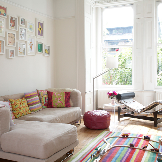
Since we have had children, I have often found myself seeking out practical family living spaces.  Life can undoubtedly be hard work with kids and you don’t want your furnishings and arrangement to be making things harder.  I’m talking muddy shoes, crumbs everywhere and impromptu baby erruptions.

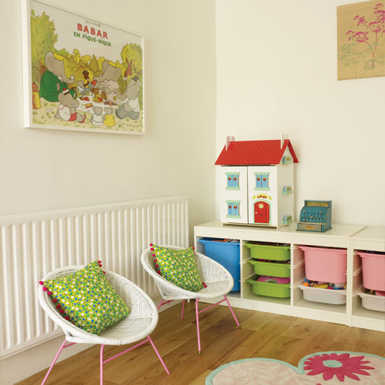
family livingpractical family living
The Right Flooring
We’ve lived in 3 different properties now, our first house had carpet throughout, the second had some original, varnished floorboards and ceramic tiles and our current house with oak style laminate and tiles throughout the downstairs of the house.

I have to say the most practical of these has been the hard floors, carpets just don’t seem to stand up to the needs of our family.  Any spillages can be wiped away swiftly, so no matter what is thrown (sometimes literally) at it, it can bounce back quickly. Floorsave have a great range that would all work well in a family living space.

Storage is the Future
I bang on about this all the time but honestly, good storage is priceless.  I’m a bit obsessed with the mid century look at the moment so I adore the string storage units at Haus. Even on a budget, remember stroage doesnt have to be hideous either, try and think out of the box.  Could you use a traditional wood dresser from with some storage baskets to keep clutter at bay?  Try your local auction for inspiration, solid wood and affordable price tags.

Easy Clean
From the sofa to the windowsills, try your best to make things easy to clean.  Our Ikea sofa has removable covers, but leather can be equally good as it is wipe clean!  And by clearing clutter off ledges and shelves there’s less things to be broken or just catch dust.

Keep it cosy
I love the layered look and have pillows and blankets strewn around our living room.  I tend to get mine from Homesense as there is a wide nd ecclectic range to choose from.  Acessories are especially good for family rooms as they have the added benefit of being perfect for den building or you could even create your own tent!  Try not to be too precious with the things you have and jump into the fun.

1/2/3/

Disclosure: Post in collaboration with Floorsave, all thoughts words and opinions my own.

8 of the best children’s lampshades

June 14, 2014 by Jenni Clutten | 2 Comments

A friend of mine is about to move house and text me to ask me about the best place to buy lampshades.  After having a good browse online and suggesting my favourite places I was excited by what I saw.  Whilst I was searching, I was inspired by the lovely designs I found that would look great in a children’s room with options ranging from £6 – £49.

So here are 8 of the best children’s lampshades for you to admire.  The best thing about these options is that they should age well, nothing to cute and ‘babyish’ and loads suitable for a boy or a girl.  These are particularly good if you have two children sharing!

childrens lampshades
I would happily have any of these lampshades in my house, they are fun, quirky and bold.  Nye has a personalised balloon lampshade in his bedroom, even though the rest of his room has now changed.  Since we moved, and put up wallpaper I think that the plane lampshade above would be an impressive upgrade to his space.  Seeing it on the Laura Ashley website really surprised me, and it just goes to show that it’s worth having a good browse, even in unlikely places, for design inspiration.You can find all the lampshades above online, with sources available here.

Top tips for creating a family bathroom

June 4, 2014 by Jenni Clutten | 3 Comments

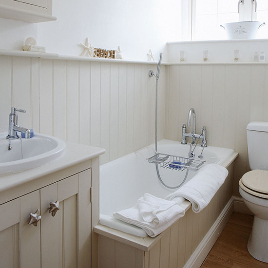
A bathroom can be small or large but we all know that it’s used by the whole family.  It should be an enjoyable space, suitable for children’s bathroom time but also parent relaxation, so here are my top tips for creating a family bathroom.

Make the best use of space
Start by planing the layout, to make best use of the space.  When designing a room I like to ensure we are getting the best possible solutions and ask myself;

  • What do we need? - toilet, bath, shower etc.
  • What would we like? – mosaic floor, free standing bath etc.
  • What is practical and affordable? - built in bath with shower,

You’d be amazed at the different layouts that are possible, even in a very small bathroom.  Changing where just one item is, can make a massive difference and turn a chaotic space into a haven.  I love to have a refreshing shower in the mornings, so a clever shower enclosure is a must.

Use clever storage
Like any room in the house, there is never enough storage space in a bathroom, especially if all you have is one tiny bathroom cupboard.  Pinterest is full of lots of very clever storage ideas, but the most simple is to install as many shelves as you can to maximise space.  Of course open shelves are great for the neat and tidy but using curtains, baskets or cupboards can allow you to hide children’s clutter from prying eyes.

top tips for creating a family bathroomPersonalise it
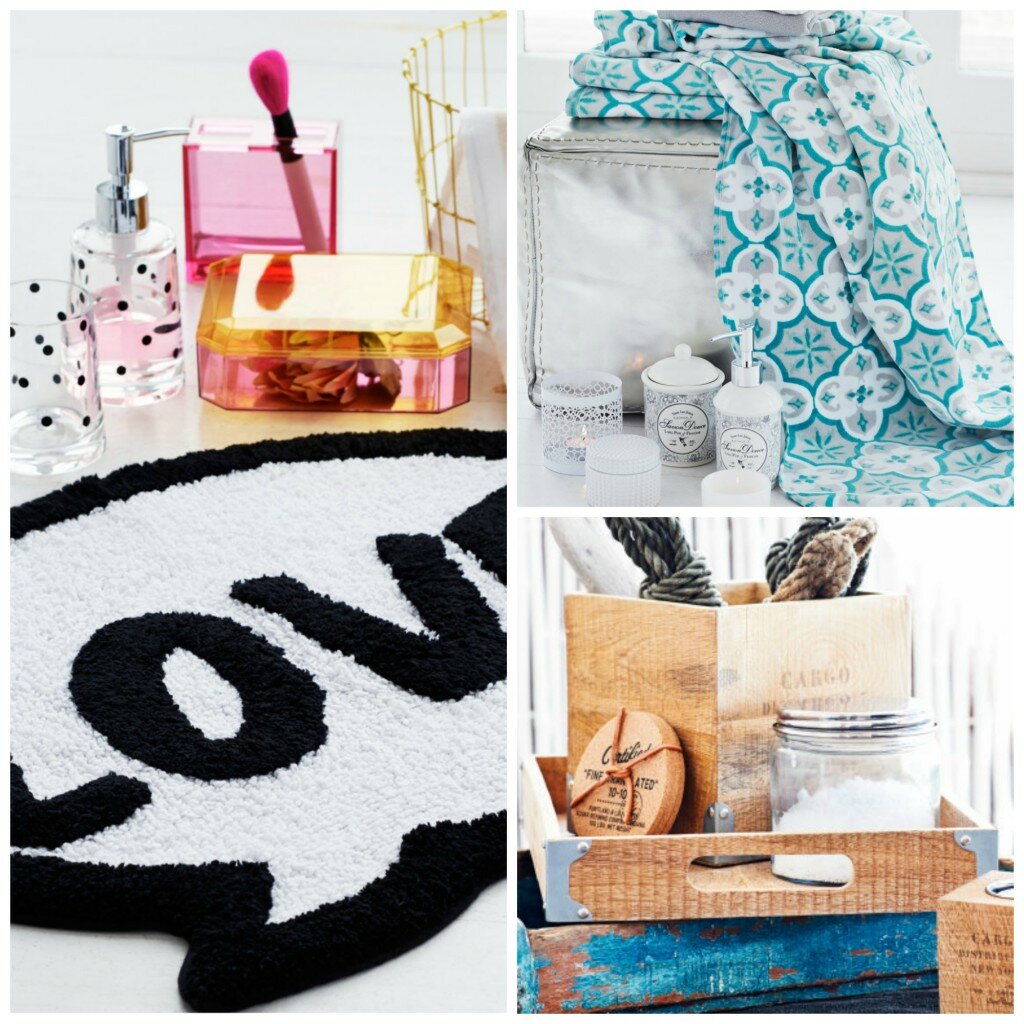
A great room is reflective of the people who live there.  Having trinkets in a bathroom can take up much needed space, but why not add a bit of interest through your towels.  There are so many gorgeous designs that can give you a particular style.  We have some Cath Kidston ones which I picked up at tk maxx a few years ago and there are some thrifty and stylish options at H&M.

Have a bathroom audit
On a regular basis I find it really useful to go through all our bathroom supplies and check what is out of date, unused and just taking up unnecessary space.  This allows me to clear space, and stock up on things before we run out.  And whilst I’m there I love to give the bathroom a good once over, a tidy bathroom makes a massive difference.  For a simple and thrifty bathroom cleaning kit, see Thrifty Mrs.

1 / / 3 / 4

Disclosure:  This is a sponsored post, but all thoughts, words and opinions are my own.

Creating a garden office

May 23, 2014 by Jenni Clutten | 3 Comments

We are still in the process of creating a garden office as a new and productive space for us to inhabit.  Our plans began when we bought our house and inherited 2 sheds.  One is quite large and with a little TLC we knew it would be a perfect way to give us an extra room without resorting to an extension.

A lick of paint:
It is quite amazing what a quick lick of paint can do for a place.  I painted our shed before winter set in last year and after just one lick of paint it was already looking unrecognisable!  And why stop there?  By painting the inside you can create a light and bright environment too.  Don’t forget to raid your local community repaint scheme.

Get wired up:
If you don’t already have an electricity supply, then I’d invest in having one installed.  This way you can work without fear of your battery running low or even work away long in to the evening.  A power supply is vital for sewing machines, lighting and turn an old shed into a executive office space!  For internet access, you may find your wifi extends as far as the shed, but otherwise a wifi signal booster may be required.
Keeping Warm:
Insulation heating and flooring are a must.  With minimal expense they give that homely feel to a place as well as ensuring that .  I am a big fan of vinyl flooring, which is easy to lay, warm and looks luxurious.  There are a few ways to insulate a shed but for the long run, foil bubble wrap works well with plasterboard over the top.  To keep warm I’ve also bought a fan heater which will enable use to keep the chill off in the winter and works as a fan in the summer.

Personalisation:
Pictures, posters and soft furnishings all transform a space to make it unique and a joy to work in.  A garden office should be comfortable and inspiring, a place where you actually want to spend time!  I just love the idea of adding beautiful curtains, practical as they will keep the drafts out but adding a chic tone too.

Disclosure:
Post in collaboration with Carpet Right, all thoughts, words and opinions my own, unless otherwise stated.

Balto Contemporary Vase – Habitat Review

May 11, 2014 by Jenni Clutten | 7 Comments

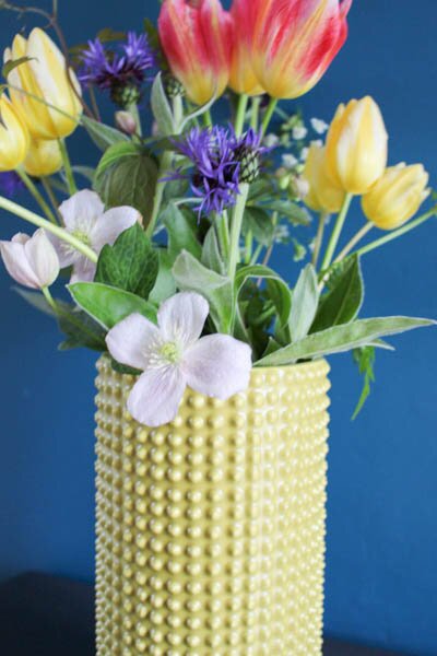
gb.habitat (1 of 1)-2Who doesn’t love a statement piece to brighten up a boring space.  I find the fantastic thing about some vases is they can look good with or without flowers and the Balto vase from Habitat is exactly like this.  Bold, bright and tactile it’s perfect for any space.  To touch it feels substancial, with its thick textured body and that bold saffron yellow exterior calling your eyes over.

The colour is bold but not brash and the texture catches the light giving it an extra 3d kind of element.  I particularly like it against a contrasting background which is why I placed it in my living room against my teal fireplace wall.

The vase is perfect for cut flowers, at 28cm tall its larger than the avergae vase so stops flower stems from drooping and alows to create a fun arrangement.  I picked flowers from my garden, some cow parsley for foliage, then lovely bright and bold tulips and even a bit of delicate clematis. I think this vase would look particularly good with dafodills too, their tall trumpets picking out the yellow in the vase.  Picking flowers is such a joy, I highly recommend it for a bit of light relief!

Disclosure:
I was sent the balto vase free of charge for the purpose of this review, all word, pictures and opinions are my own.

First Time Wallpaper’er

April 11, 2014 by Jenni Clutten | 4 Comments

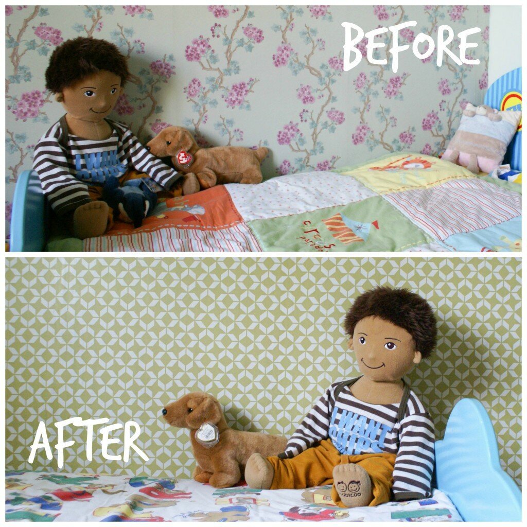
wallpaper,beforeafter.TEXTI have an admission to make – despite lusting over many a design, I have never actually hung wallpaper.   Many times have I admired it, shared it and dreamed of it but never had it graced my walls.   I was a first time wallpaper’er.
That was until I moved into a house with floral wallpaper all over my sons bedroom and no time to remove it.  That’s the thing with wallpaper isn’t it, it’s so personal.  I wonder if anyone has ever moved into a house and kept the previous owners wallpaper long term.  We’re planning to live here for many years to come so when decorating our house I’m going for designs I really love without giving a second thought for resale potential.

I tested the ground of wall patterns when I installed cloud decals in the nursery and I absolutely loved the fun look they gave to the room. So, on with the wallpaper show!

You will need: (I watched the video tutorial on the  channel before I started)

  • Wallpaper Paste
  • Bucket
  • Stirrer
  • Wallpaper Brush
  • Sharp Knife
  • Scissors
  • Wallpaper
  • Microfibre Cloth
  • Ladder/Step Stool
  • Tape Measure
  • Spirit Level
  • Pencil

hanging wallpaperSONY DSC

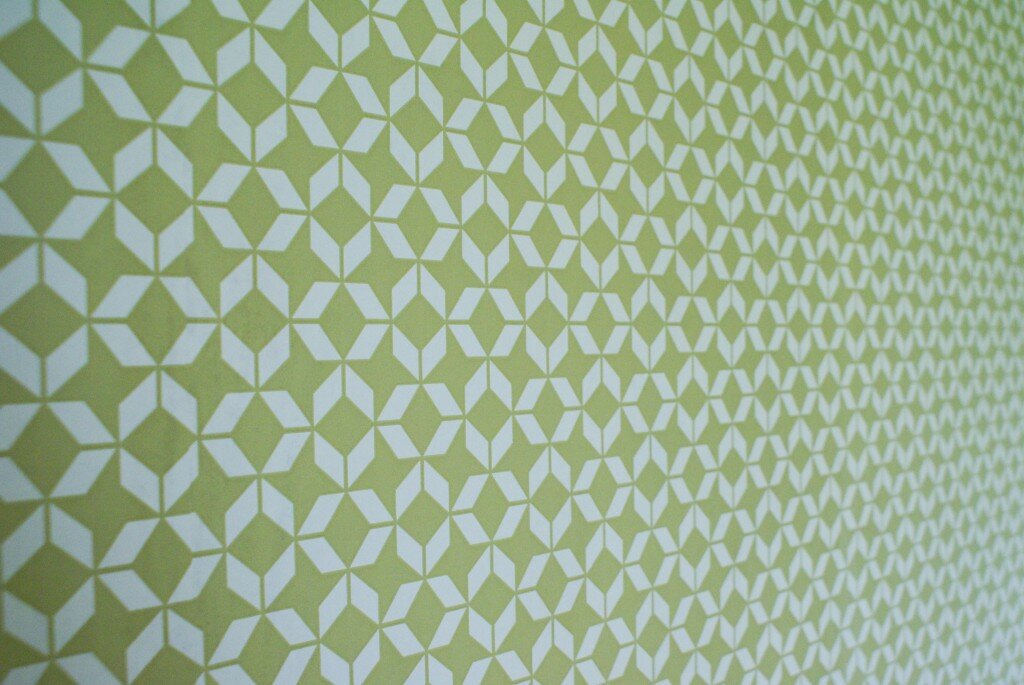
 As novices, it seemed best to start with some inexpensive paper as a trial run.  This wallpaper is called Brooklyn and I got it on clearance in B&Q, £5 for 3 rolls!  We originally got it for our bedroom but I realised it would look great in Nye’s bedroom.  It’s paste the wall wallpaper so we mixed the wallpaper paste to its thickest setting and applied it straight to the wall before lining up the wallpaper. (And no, we didn’t remove the old wallpaper or start in the middle).  In the end we used about 1 1/2 rolls and it was easy to line up because it has a very busy repeat pattern.

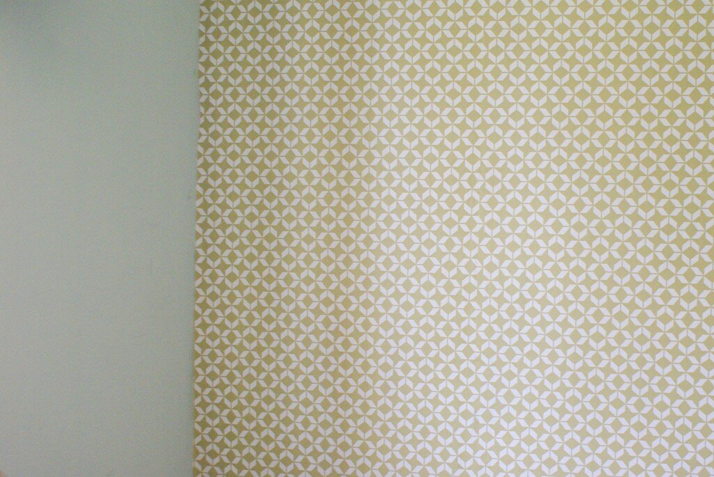
In terms of timing, this first wall took us about 2 hours.  Because it was our first time with wallpaper we double checked all the measurements and then had to rehang the paper after I got a bit snap happy and trimmed too much off the bottom of the first sheet.  (At that point I was pretty fed up, but carried on regardless).  Despite this, in the evening we decided to hang our Marimekko Kippis wallpaper in the dining area (A cheeky Ebay purchase for £30).   Because we still had a huge amount of wallpaper paste lying around unused and all the tools still out it seemed sensible to continue.  The dining room wall only took an hour, as we already had a good wallpaper work flow worked out.
SONY DSCThere’s still much to finish off in the bedroom and dining area but I’m so pleased to know that we’ve at least started to put our own stamp on the house (and learnt a new skill).  They’ll be more to share in the next few weeks as the rooms start to take shape.

How about you?  Been lusting after some gorgeous wallpaper prints? Are you a pro or a first timer like me?
Love Chic Living and Love Your Home